Let’s create an H-R diagram using Python! First, we need to collect a dataset, and I have obtained one from the website URL below.
https://github.com/YBIFoundation/Dataset/blob/main/Stars.csv
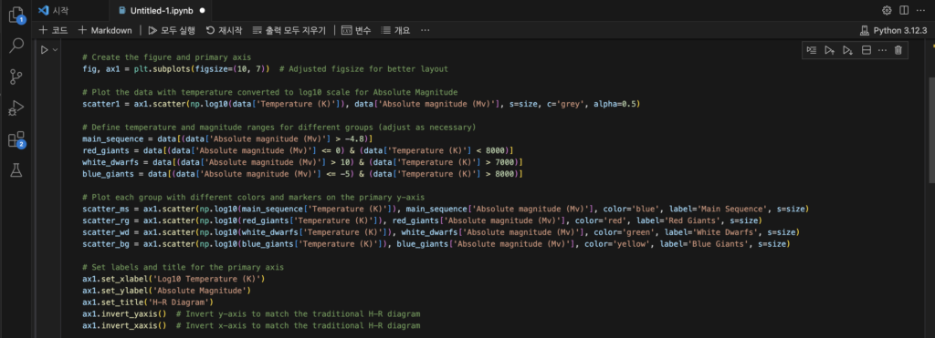
I also captured the code I wrote to create an H-R diagram for the dataset I downloaded.

These are the codes for the basic setup to create the diagram

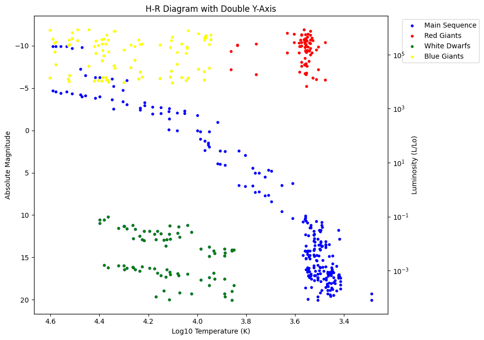
The code plots an H-R diagram using a dataset containing temperature and absolute magnitude values for various stars. It first creates a scatter plot where the temperature is converted to a log10 scale on the x-axis and the absolute magnitude is on the y-axis. The dataset is then divided into different groups based on specified temperature and magnitude ranges, identifying main sequence stars, red giants, white dwarfs, and blue giants. Each of these groups is plotted with distinct colors: blue for main sequence stars, red for red giants, green for white dwarfs, and yellow for blue giants. Labels for the x-axis, y-axis, and the plot title are added. Finally, the y-axis and x-axis are inverted to match the traditional H-R diagram, where the temperature decreases to the right and the absolute magnitude increases downwards.

First, it creates a secondary y-axis (ax2) that shares the same x-axis as the primary plot (ax1). This is done using the twinx() method.
Next, it plots the luminosity data for each group of stars (main sequence, red giants, white dwarfs, and blue giants) on the secondary y-axis. The temperatures are again converted to a log10 scale for the x-axis. Each group is plotted with the same color scheme as before: blue for main sequence stars, red for red giants, green for white dwarfs, and yellow for blue giants. The size of the points is determined by the size variable.
The y-axis label for the secondary axis is set to “Luminosity (L/Lo),” indicating that luminosity is being plotted in units of the Sun’s luminosity. Additionally, the y-axis scale is set to logarithmic using set_yscale('log'), as luminosity is typically plotted on a logarithmic scale in H-R diagrams.
And when you run all of this code, you will obtain the final result shown below!!

I don’t know what happened to the blue dots in the blue giant group area 🙁
